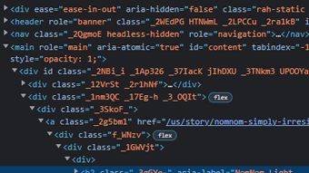
Code

The code does not look like a human designed the classes and possibly the structure, because if you look at the class names none of them make sense. There is flex inside some of the divs of the code, which then makes me wonder if the developer added the flex in or if that comes with pre built structures.
User Interface - UI

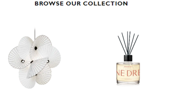
I thought visuaully this website had appealing pictures, colors, and even a video used as a background with sound included (which I have not seen). There is nice looking animations that appear while scrolling which adds another aspect that makes the site more unique. I also found the menu interesting since I have never really seen a menu located in the area it was and it stays in the same place wherever you are on the screen.
User Experience - UX

While exploring this site it I found many differnt things that you do not normally see on other websites. For example, back the menu button on the bottom of the screen, this made it easy to find where to go if you are lost on a page or what to search for. Another area was the microphone botton on the top left where you can speak to search items, I do not feel like you have that option on lots of other sites so it could help with accesibility. On the "Read the story" page a the bottom where it shows "Related Stories" the grab and drag scroll to go left and right was different and confusing at first, but could be looked at positively and negatively.
Summary
My thoughts on this site are, this is a very appealing site to look at and explore. The navigation menu helps to get where you need, though some pages do have a lot going on, which could make it overwheling for others. The structure of how it was built is the part I am curious about, since the class names are obvioudly not created by a human.